Unless you possess the power of mind control, getting consumers interested in a product isn’t an easy enterprise. Marketing and advertising campaigns are reliable methods, but there’s another way to transform the public perception of your product: creative packaging. This simple tool has a proven effect on the level of success and attention a product can receive.
One of the best examples of this method in action is none other than the infamous Pet Rock from the 1970s. If not for the pet carrier box, the straw lining and the booklet enclosed, no one would have ever thought to buy this product. Due to the packaging alone, 1.5 million pet rocks were sold for $4 each. The owner quite literally became a millionaire by selling rocks to consumers. That’s how powerful packaging can be.
The best and most creative packaging ideas start with the product itself, using it as the inspiration for its packaging. Time has progressed since the Pet Rock and there are hundreds of new, clever ways to package products. These are a few of our favorite examples.
1) New York City Spaghetti
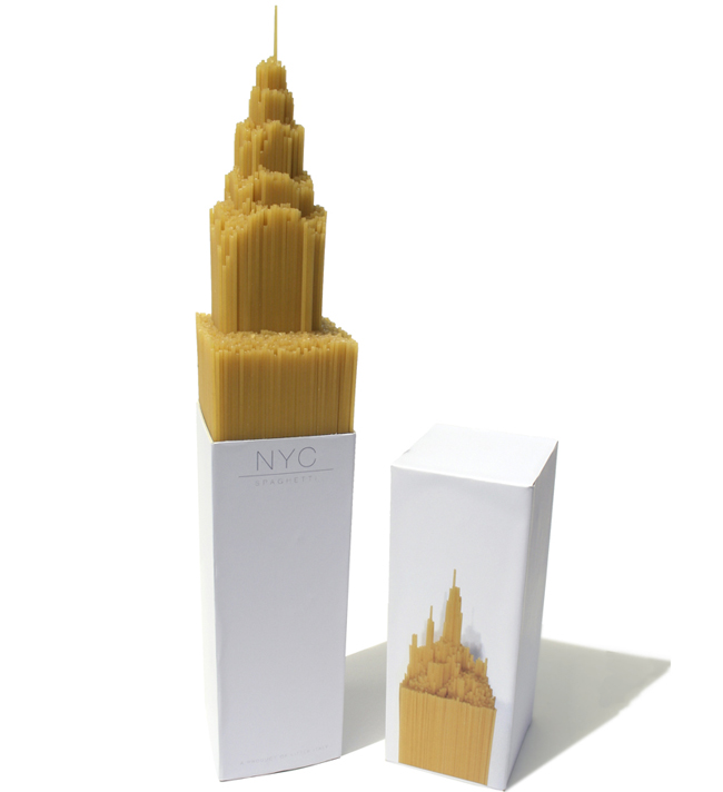
This packaging was originally created as a University project by designer Alex Creamer and has received a lot of media attention. According to Alex’s website, “NYC Spaghetti started as a university project, where we explored different ways to package everyday food items. My choice was spaghetti. Rather than build a facade or pack around the spaghetti, I decided to make the product itself the focus. When tightly packed together the spaghetti began to take on sculpture like properties that when placed on different surfaces would create a like for like impression on top. This led to the idea of NYC Spaghetti, a series of skyscrapers around the world made out of our favorite Italian food. In this instance a model of the Chrysler building (created by Ben Thorpe) was modeled and pushed into the spaghetti creating a similar impression on top.” It looks like her innovative thinking really penne-d off.
2) Gnome Bread & Note Headphones
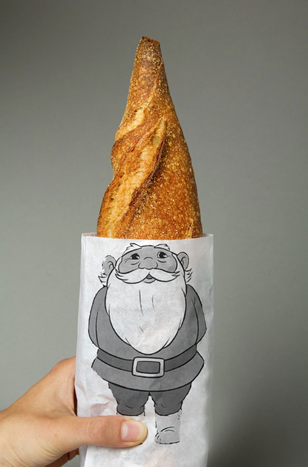
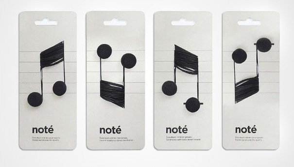
These are a few simple ideas that are still creative. The packaging in the first photo was created by Lo Siento Studio, a graphic and media design company founded in 1996. It gives the simple bag that comes around a loaf of bread a whimsical feel. The second comes from designer Corrine Pant and displays headphones as music notes. It’s a simple concept, but it can really stand out amidst the typical boring chords.
3) Ford Ranger Extreme: Matchbox
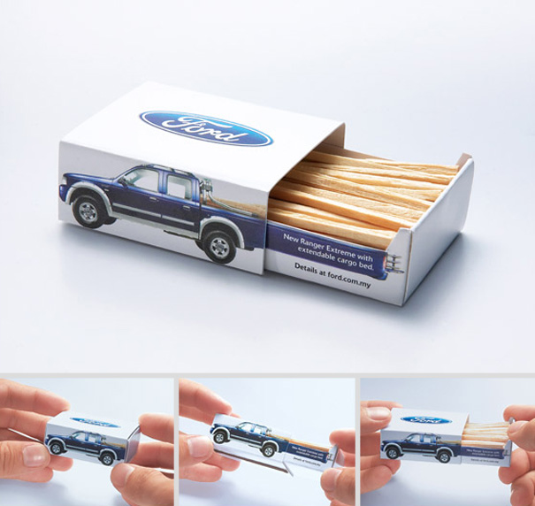
This one was created by an advertising agency called JWT from Kuala Lumpur, Malaysia. As pictured above, they used matches to look as though a Ford truck was carrying planks of wood in its extendable cargo bed.
4) Mustache Paintbrushes
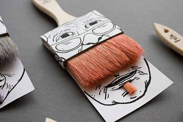
This is another example emphasizing the idea of a product inspiring its packaging. These Moustache Paint Brushes were designed by Simon Laliberté and feature a series of fuzzy-faced friends to make the a paintbrush more humorous.
5) Hanger Tea
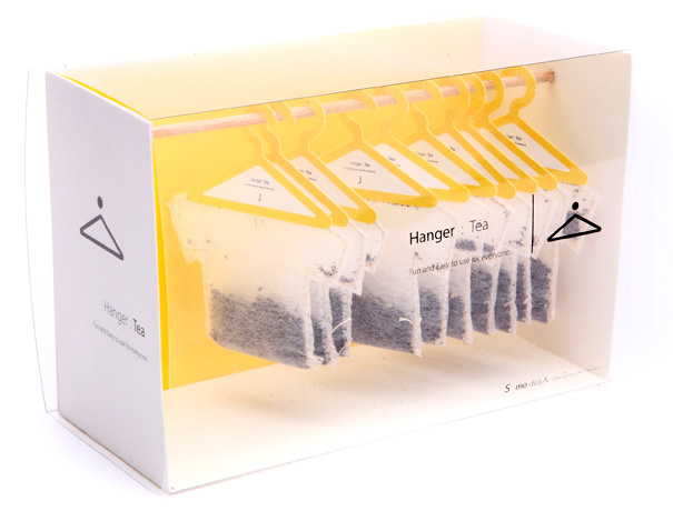
Created by the designer Soon Mo Kang, Hanger Tea is both useful and creative. It has a cute, simplistic look, keeps your tea bags organized, and allows your tea to hang perfectly at the edge of your cup while it steeps.
6) Penguin Juice Boxes
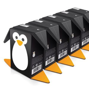
This one is just plain adorable. Creative Guerilla Marketing took the flaps that you’ll find at the ends of juice boxes and transformed them into the flippers and feet of an adorable penguin.
7) Playable DJ Pizza Box
Getting into the more technical territory, Pizza Hut took things to a whole new level by creating a fully functional DJ pizza box. Is this something we needed in our lives? Honestly, probably not. But we can’t deny that it’s extremely creative and certainly got them some attention.
8) Loot Crate
Many monthly box subscriptions, such as Loot Crate, are also known for their creative packaging. Every month, Loot Crate will choose a theme to feature and the box itself either becomes the backdrop of a scene, a diorama, or it can be folded up to become an item of its own.
How’s that for thinking outside the box?

